Custom Presentation Boxes built by Mullenberg Designs for Pierce Promotions.


Contact Mullenberg Designs & get started on your next big Presentation Project!
info@mullenbergdesigns.com | mullenbergdesigns.com | 207 602 1571
Contact Mullenberg Designs & get started on your next big Presentation Project!
info@mullenbergdesigns.com | mullenbergdesigns.com | 207 602 1571


Contact Mullenberg Designs and start your next Presentation Project!
info@mullenbergdesigns.com | mullenbergdesigns.com | 207 602 1571


Contact Mullenberg Designs and start your Presentation Project!
info@mullenbergdesigns.com | mullenbergdesigns.com | 207 602 1571


Contact Mullenberg Designs & start designing your Custom Print Portfolio!


Contact Mullenberg Designs today for your next Presentation Project!
info@mullenbergdesigns.com | mullenbergdesigns.com | 207 602 1571

2-Fabric Covered Full-Case Portfolio and Custom Slipcase built for #Photographer Will Graham :


info@mullenbergdesigns.com | mullenbergdesigns.com | 207 602 1571
Classic Clamshell Case built for #Photographer Maarten de Boer


info@mullenbergdesigns.com | mullenbergdesigns.com | 207 602 1571

Branding your Portfolio or Presentation Case is an important part of the design process and we are here to help.
At Mullenberg Designs we use a hot stamping press to create a deboss that sinks your logo below the surface of your portfolio cover.
We achieve debossing with a magnesium die that we have fabricated from a digital file of your logo that you will provide. The die is heated up to 250˚ sinking your logo into the surface of your portfolio’s cover fabric.
We offer several options to help you personalize your logo imprint including Blind debossing and Color debossing. Check out this BLOG POST to see the different imprints options in action!
When pulling together your logo design and determining its position on your cover, Scott has these words of advice, “consider the portfolio to be your canvas and the deboss your painting”. It is the final touch that personalizes your portfolio and expresses your brand identity.
Here are some great examples of Logo Placements with impact:


info@mullenbergdesigns.com | 207 602 1571 | mullenbergdesigns.com

• Bespoke iPad Presentation Cases ~ Personalize your digital presentation •


Need to Upgrade your iPad Presentation?
Contact the binders at Mullenberg Designs:
info@mullenbergdesigns.com | 207 602 1571 | mullenbergdesigns.com

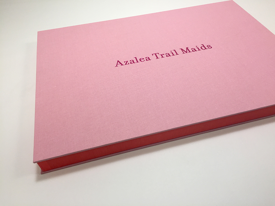
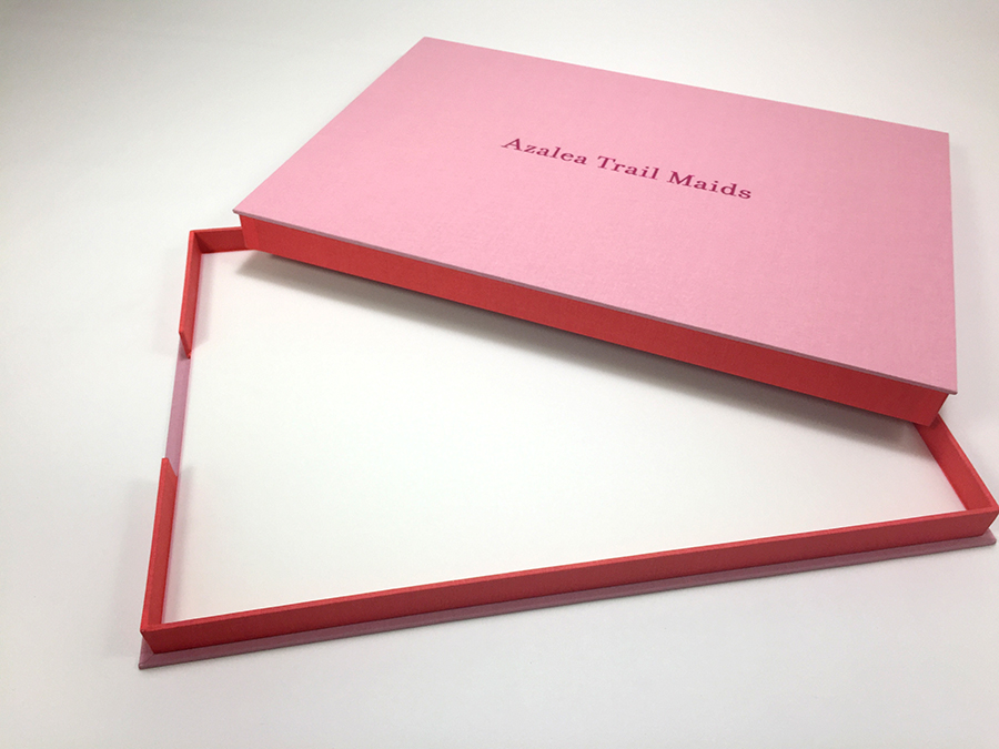
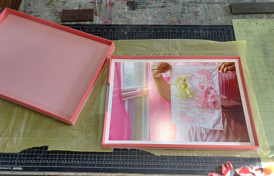
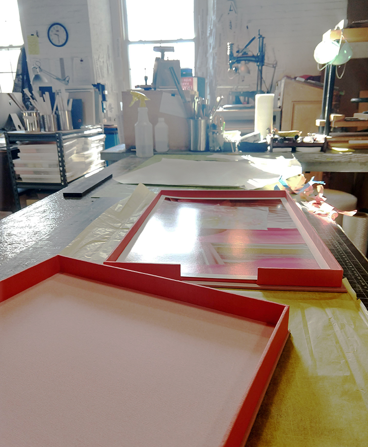
Adair Rutledge opted for a 2-Piece Clamshell Case to house her photo series: Azalea Trail Maids. We love the coral / pink fabric combination and the HOT pink deboss. A perfect compliment to this photo series, so rich in color and content!


• Bespoke Presentation Cases for Creative Professionals • #PresentYourselfBeSeen
info@mullenbergdesigns.com | mullenbergdesigns.com | 207 602 1571
